![]()
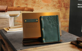
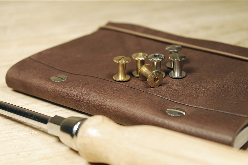
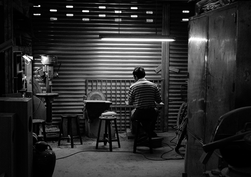
Jusqu’ici, La Compagnie du Kraft n’était pas une marque, juste un atelier logé au fond d’une cour depuis les années 30. Un atelier typographique capable de produire quelques petits milliers de carnets pour forestiers.
Et puis vous êtes devenus de plus en plus nombreux à utiliser nos productions et à changer notre nom pour aller plus vite en le prononçant : La Compagnie du Kraft se transforme ainsi régulièrement en LCK.
On est bien ancré dans nos valeurs, no doubt. Mais on vous écoute quand même, c’est cela le marketing, non ? Alors on a pensé qu’une identité de marque pouvait être utile pour nous, comme pour vous. Mais on reste des typographes, alors rien de compliqué, pas de logo tordu ou d’explication d’une page.
A vous de nous dire ce que vous en pensez…
Brand identity
Up until now, La Compagnie du Kraft has not been a brand as such, but more a factory lodged at the back of a courtyard since the thirties. We were just a typographic workshop capable of producing a couple of thousand notebooks for lumberjacks.
And then you became more and more numerous in using our products and, to go quicker when saying our name, you regularly refer to La Compagnie du Kraft as LCK.
We are very much attached to our values. There is no doubt about that. But we do listen to what you have to say. Isn’t that what marketing is all about? So we are thinking that an identity to our brand could be useful to you, and to us. Of course, we will always remain typographers, so nothing complicated, no weird and wonderful logos, no one page explications.
What are your thoughts on this ?